Thursday, November 24, 2011

Favourite First Semester Assignment


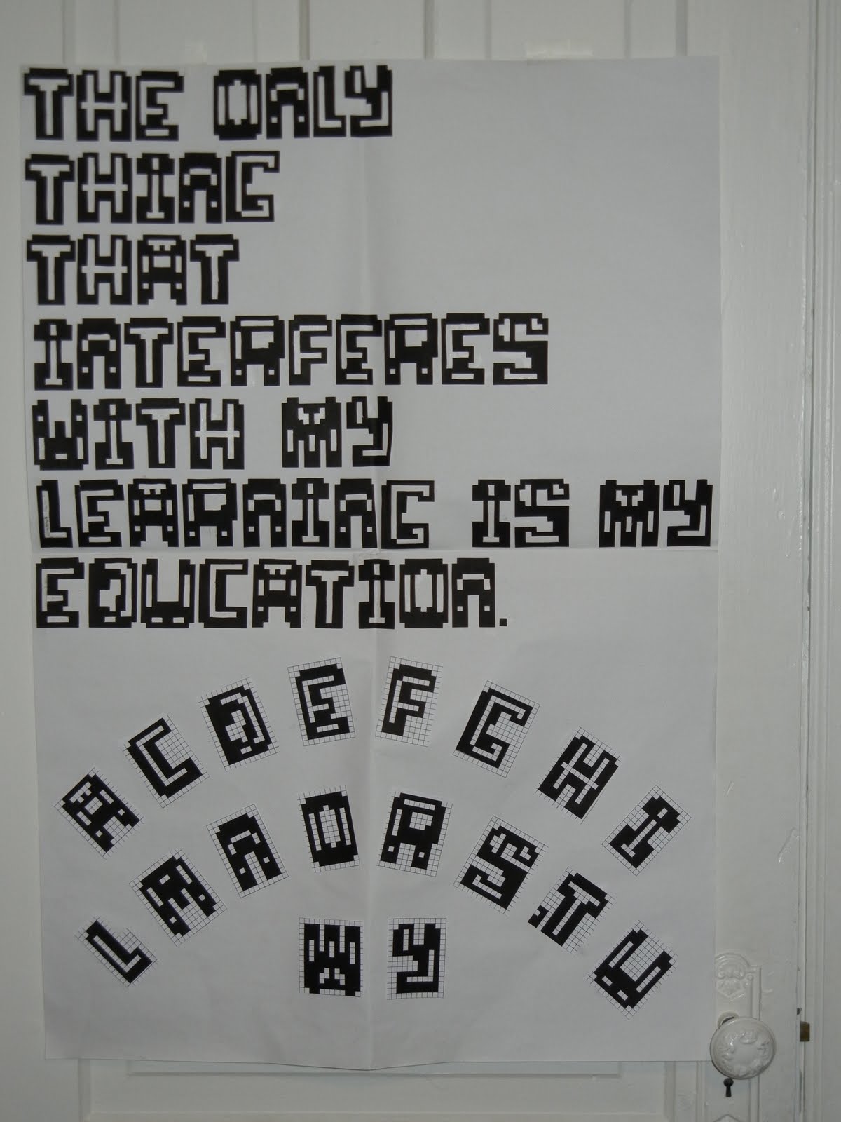
The assignment I'm most proud of is my first assignment for my Typography class. The assignment was to create a bitmap font (only using squares with no stair casing to make any curved lines) and I created these crazy letters. This assignment was my favourite but it was also the one that I put the most time into and did the most revisions for. I can point out flaws in it as well such as some letters appearing heavier than others, but when I look at it I don't really mind.
We had to pick a quote to write with our letters and this one is from Albert Einstein. Not something I would say I relate to in every way, but I can understand the sentiment behind it, and also kind of a funny thing for him to say.
This project holds a funny place in my heart because I did the entire project painstakingly on the Paint program (embarrassingly) and it really was hell. Then I xacto-knifed it every letter out (including the holes inside each letter) and then glued them all on this big paper. I was so happy to be done the project that I guess in my exhilaration I arranged the alphabet below in a weird way, but it's how I was feeling at the time.

-Lauren

REVIEW of the blog


The blog played many roles in this class. It was an icebreaker at the beginning after it became a place of sharing, and then it became process work. But best of all it is an entertaining way to get easy marks :-).

It is amazing how when we come to class we don't have to jump straight into work but we have a half an hour to relax and wake up while getting to know each other and familiarizing ourselves with different artwork.

My favorite blog posts were the very first ones and the very last ones because they are the most personal of all.

I never wrote a blog post before this class but it turned out to be fun. It's almost like a diary that I never had. :-)

I think this blog was an AWESOME idea!

Me As A Cartoon Character

This semester was amazing and full of exciting projects. Each of them taught me something about me and of course about art and design. I'm not the best artist or designer that got accepted to OCAD but if I was I would have nothing to learn here and I would be bored out of my mind.
I can not pick a project that is my favorite so I would just post the most resent and so it happens it is the same one that Trisha posted :-) but hey you get to see my personal view of that project. (P.S. Trisha, your portrait is amazing)


WOW! It looks better here then it does in real life (I love when camera doesn't work against you). I love this project because we got to full around with photo booth for homework.


Also, it's pretty cool because we were allowed to use any medium we want and didn't have many other guidelines. I like analog projects because they are a good combination to all the computer related work we do in other classes. It's is nice to switch between digital and analog because it is a completely different experience.

T-Shirt Design...?

This was actually my first painting work for my Colour in Context class. What we had to do was come up with one design for a T-shirt and use different colour scheme. If I remember, there was four colour scheme we had to do and then choose which one we like the most. The four colour scheme was monochromatic, achromatic, our favorite colours, and lastly our least favorite colours. The one you see below are my favorite colours. This actually ended up being my better paintings than majority of my others ones and I like this one the most. Though that doesn't really say much as I find it just about decent and the fact that I'm really really bad at painting. As you can see, this was basically a design of the sky that match the colours of the sunset going down. While I do like this one, I don't think it really goes well as a T-shirt design as they're more simplistic and usually have only one or two colours.

 (Sadly, this was best way I could've shown the whole image as scanning it would only show about 2/3 of the painting.)

As for the blog, I had quite fun with. Seeing other people's post was very enjoyable and interesting to look at. It's not often where you see students sharing their own personal opinion about a certain piece or a theme and I thought it was a great thing. Sadly, there weren't many frequent blog post mostly due to time constraints for many of us. Even so, I enjoyed it nevertheless.
This sketch I did for the book cover is my favorite piece of work this term. The reason why this is my favorite piece is because it was the only one where I actually did some illustration on a project this year. I love to draw and this project was the only one where I had to freedom to illustrate what I wanted.   

about the blog

I'm not really sure exactly what to say about the blog. I am new to blogging and was horrible at keeping up with it for starters but I think it was an interesting class element. Seeing what everybody posted was pretty cool. From pictures, to music, to video clips (ponponpon is a definite stand out LOL) I was exposed to material that I most likely would not have come in contact with otherwise and I can definitely appreciate the wide range in taste that was displayed across this class. All in all, good times, and if I were to do this again I would probably try harder to keep up with it.
-Tim-

sometimes I doubt your commitment to sparkle motion


One of my favourite pieces from this semester (aside from my work made for this class) would have to be my donnie darko painting for my colour and context class. We were to take an image (movie stills were a suggestion) and paint it using a range of shades from a colour scheme of our choice. I chose to use the complimentary colour scheme of orange and blue and a scene from the last half of Donnie Darko.

After having trouble with coming up with an idea, changing my colour scheme at the last minute and going through illustration board drama...I am actually really happy with the way this painting turned out.

Sadly, all I have at the moment is this crappy phone picture of it since as far as I know it's still on display in the school somewhere.

____________________________________________________________________

and as far as the blog goes I thought it was a great thing to have for this class. Seeing how everyone approached the same theme in many different ways was extremely helpful and interesting. I also had the chance to see some great work (and be introduced to some great music haha) I wish we had all posted in here more frequently however personally I found I often didn't have the time to post here besides for the weekly post (admittedly, often at the last minute)
..thankfully I've been getting my time management together.
overall its been great, thank you all :)

-Alex B

Fun With Faces

In my Illustrative Drawing Principles class, we were given an assignment to create a caricature of a famous person. It was suggested that we choose someone with "character" in their face as they would be easier to work with and push the facial features to an extreme. I found this to be one of the more enjoyable projects.
The celebrity I chose was Ron Perlman because, come on, look at his face, he's almost a caricature already. We started off with 3 preliminary iterations of our chosen person, each drawing pushed farther than the one prior.
These are the first 3 mounted:
For my final version I aimed for a middle ground between the second and third versions and it turned out like this:
-Tim-

Photo Booth Fun!

Hey everyone!

Unfortunately, we are not allowed to post projects from this class and it's a shame because I found Communication Design to have had the most fun assignments of the semester. If that wasn't the case my favourite project would definitely have to be my "google doodle" because I simply enjoyed every bit of work that was essential to the final result! (Also because it put me into the Christmas mood!)

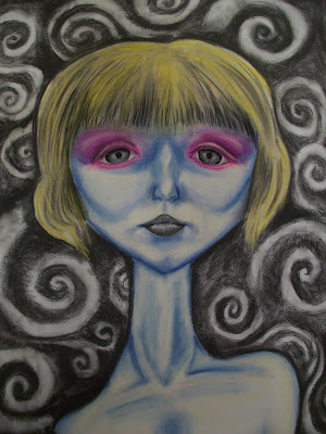
That being said, the assignment I enjoyed second best would have to be my distorted self-portrait done in Drawing: Visualization. We were to take a series of pictures with effects in Photo Booth, choose one and then re-create it poster size with a medium of our choice. Throughout the semester I have used various mediums in my work and I wanted to use something I hadn't used yet. It has been a long time since I've used pastels, the last time probably would have been in grade 11! So, I wanted to challenge myself and learn once again how to work with pastels.

With many of hours and tons of blending, I am very happy with my "Alien-Faced Self-Portrait!" Every self-portrait I've ever done never turned out the way I wanted it to, this time I delivered!


Process:


Final:

comdes1 section 18

Because I can't think of a title right now.

This blog, I could have actually liked this blog more if I just didn't see it as homework. It technically is, but as a blog I should've treat it like tumblr and contribute more like commenting and stuff.

Because of the class blog, I now have Breakbot in my iPod and see real people for each iconic typeface (damn Font Conference). Interesting facts and others' interest kept me interested in this course. I really love knowing what other people in the class are up to and being able to share what I like. Sharing is part of learning :)

purple afro


This is my 2nd project for advertising concept class. And you have no idea how much and where I've been through to get to this idea. I never thought that making an ad as simple as this one could be so difficult!
Our task for the project is basically to make a print ad for one of the given brands: Red Bull, Kitkat and Chanel. Given just the brand's iconic background, the whole class had their creative playgrounds so wide most of us don't know where to start.
Then the prof told us to use music, choose a song as inspiration. But I had too much favourites in my iPod.

"Have a break, have a Kitkat."
That's basically where I started. Then after dozens of ideas, sketches, headlines, etc. I came across their panda commercial. It was the best therapy for my stress lol. And it totally inspired me to use animals as characters. And for Torontonians, seagulls are just the craziest species out there.


The song that inspired the look and the concept is "Around the World" by Daft Punk. Well, it was originally Party Rock by LMFAO but somehow I felt Daft Punk was the chosen one :\

I didn't get the best mark ever but I totally enjoyed this project and the outcome. Hope you guys enjoy it too!

Wednesday, November 23, 2011

Bleeding Letters

For my second typography project we had to create a 12'' x 20'' poster using type only. What was required of us was to use the dot matrix system that printers use in order to create the word "typo". We were also asked to use our first project, which required us to paint the word "typography" in four different typefaces on several sheets of 11'' x 17'' paper, in this project although many of opted to not as it didn't produce the same clean result you would get with digital typefaces. For this project we also had to do some research on a famous typographer and include a small biography in our poster, although we had to keep in mind that the biography was a small part of the poster and didn't need to be as prominent as the word "typography".

For my poster, I chose to keep everything in a straight line (as this was what my professor asked of us originally, although he has the tendency to change his mind constantly throughout a project), but because it was plain and boring I started to fill each letter in the word "graphy" and made it look like it was bleeding letters.

In any case, I apologize for the terrible quality of the image I uploaded. The original poster is currently being displayed on the 3rd floor of the Annex Building so feel free to check it out, as well as the other posters that are being displayed there.

Gorgeous... but Deadly

For our third colour in context project, we were asked to review several works from various artists of our choice and using that image in mind, render our own altered version of the work using any 1 of the 7 types of contrast in colour. For my project, I decided to base my work off the second image shown here who I cant seem to recall the artists name! The colour contrast I used was mostly split complementary with a few accent colours. Whats interesting about this work specifically is the fact that I took a huge risk of attempting to reproduce my composition digitally rendered using my new bamboo tablet as opposed to doing it by hand. I myself was surprised by how much better it turned out compared to what I previously thought before tackling this. Im glad I took the risk! and its for this reason why I choose my "Deadly Gorgeous" piece as my final blog entry.

Sunday, November 20, 2011


This was a project for my Illustration Concepts 1 class, earlier this year.  The assignment was to produce an abstract-expressionist piece that represented a feeling or emotion of some kind.  This feeling was absolutely up to the artist, and for the most part I believe people chose anxiety.  I likewise chose this feeling... Coincidence? - Anyway! I gave the piece a couple washes of ink, with streaks, and jaggedy not flowing, inked lines.  I had a pretty muted colour scheme except for bright flashes of pinks and mint-ish green.  I really enjoyed making this work because of the freedom, in this case, abstract pieces sometimes give. 

Critique?

Our class' blog has been a great way to tell personal stories and triumphs, as well as showing favourite songs and pieces of art.  I believe the in-class perusal by Angela has greatly added to the importance, validity and interest in the blog.  Had it only been a homework assignment, that was checked by each individual at their respective residences, it would not have had the same effect.  Reading it alone at home seems more a chore than an activity to enjoy.  I think without the in-class part, the blog would have seemed much less fun to post on... I personally, would not have enjoyed searching for ideas, and pictures if I had known we wouldn't be going over them in class.  Knowing people will look at your postings greatly increases the chances of posting, and the desire to post.   On a harsher tone, I sometimes would have liked to see more postings.  Some weeks there were only a few people that posted on the blog.  Although obviously not punishable by class-mockery... I think perhaps if these people found out about stumbleupon they might have had an easier time finding things.. and getting ideas about where to find different things to post?


Saturday, November 5, 2011

Next Blog Assignment

Go to the new blog (you should have received an invitation) for project 3 and follow instructions.