Thursday, October 27, 2011

Three Ads using Expressive Type


This poster advertizing a James Brown appearance really spoke to me because the different wavy strips of 2d type on the page really give off a 3d effect, as well as actually capturing James Brown's strange face. The arrangement of the words form a picture that really looks like him, and that amazed me. The creases in Brown's face are formed by the negative space between the lines of type and his eyebrows, hair, and all else are all formed by the same one effect. I like looking at this, because it kind of creeps me out. Also, the pervading colour is blue but there are dashes of other colours in his "aura" that are subtle and compliment the blue nicely as well as give a subtle effect of warmth and light. His teeth really stand out against the blue and the black and this focuses your eye on his face, as well as the information which is done in a complimentary yellow. Look at his tongue in particular and his top lip- so much 3d depth in the way the letters are sloped and positioned. The colour of the blue letters darkens slightly towards the top/back of his face to accentuate the 3d feel, and also the words tighten/get smaller to show distance. This is a very complex image! And some hilarious "white space" acting as his hair.


This next ad for CocaCola Light Lemon is so ingenious and simple. I just love it so much. I'm always interested in what the big huge companies do for their adertizing because I imagine them to have a huge unlimited budget and like, how fun is that. So seeing how ad creators choose to use their freedom is quite interesting. In this case we see a simple, concise and literal sign, all the while remaining understated, chic, timeless and very classy (even though it is coke. I admit it: I don't even care because I love coke.) Anyway, here we can see the perfect execution of natural items (though here it looks a bit digitally enhanced and manipulated) to make a perfect replica of the classic coke logo "C", and to have a logo be instantly recognizble by only one element is a beautiful achievement in itself. This ad demonstrates everything it wishes to say in a simple way: Coke, Lemon, light. That's all this ad contains, and I am in love with it. The information at the bottom consists of an image of the product very tiny. Amazing. If I were to imagine one step further I would say that the top swoosh of the letter C is pointing towards the light, alluding to a sense of the divine. That's a pretty confident ad. I heard once that the McDonalds big "M" logo was inspired by the gates of heaven, and it's seen as one of the most successful logos of all time.

Finally, this Penguin ad uses a slab serif font that still retains a modern and embellished feel but still shys away from the ultramodern feel of sans serif fonts. I feel that this font is trying to allude to typewriters and what those letters looked like on the page. Paris is rich in history (especially literary) so I feel like this is a very appropriate font choice. The big "A" is obviously illustrating the Eiffel Tower right at the heart of "Paris" so the idea is simple, and once again elegant. Furthermore, the background is a very beautiful, textured and simple page of a book with creases suggesting a love of reading, because new books are exciting, but unexplored until you crease them up a bit by reading them. As Paris the city has history, bookpages with creases have their own history: It shows they were read once. The paper is white, but it also seems to look a little big blue, and the letters P, R, I and S seem to be a very dark blue instead of straight black, which might have detracted from the 'flow' of the image by standing out against the background and the "A" too much.


-Lauren


Wednesday, October 26, 2011

Expressive Typography

Expressive Type can be quite hard to pull off without being too literal. Expressive Type is a type of typography. Letters are not just abstract notions or carriers of meaning. They are also real, physical shapes. In typography, the form, size, and font of the letter are used as visual elements and there is not really a single style associated with this type.Most typography tends to create form with meaning based on the word itself. However I feel that creating form with the associated word with different form, size, and font successfully creates Expressive Type without being literal as long as it isn't too direct.


Tuesday, October 25, 2011

our dreams drench us in senses...

Expressive type is actually quite rare - often we see typefaces that are easily legible and simple to demonstrate the data being related.  A site that I find extraordinarily interesting is handmadefont.com where there are numerous fonts created by every-day objects (fabrics, foods, liquids, etc.).  But what I really want to share is this short advertizing film for the Typophile Film Festival 5:

Typophile Film Festival 5 Opening Titles from Brent Barson on Vimeo.

I love the way the text flows from one phrase to the next, as the text form changes and relates to each sentence.  I think this use of type is really innovative - using simple objects to create letter forms, instead of simply using already formed text.  The use of texture, colours, space, movement, are all focused on the distinction of each typeface element - what the words are made from and why. 

- Joelle

Wednesday, October 19, 2011

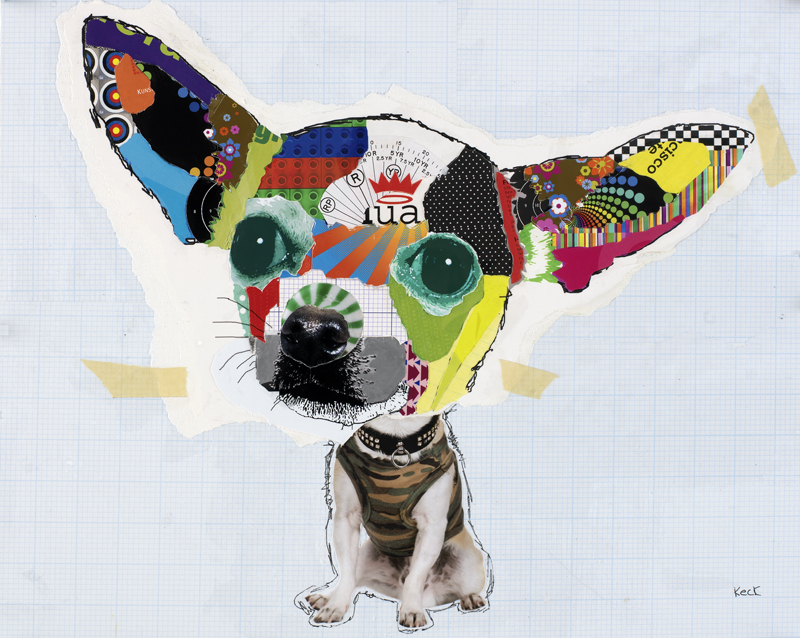
michel keck


Michel Keck has created many collages of dogs using vibrant colours, texture as well as features of the actual dog(such as eyes and nose). The background is generally on lined paper, but always a different colour or texture. The patterns are unique and the colour choices are vibrant. They make a good collection!

For all the dogs...check out the link below!

http://www.moderndogart.com/

Friday, October 14, 2011

Fragility

Link to original: http://atmosblue.deviantart.com/art/spill-65327249

I was looking up collages on deviantART for inspiration and this caught my eye (as well as Angela's as she requested that I put this up on the blog). At first glance, the contrast in colors is eye catching and attention grabbing, but after looking at the image, and reading the artist description, you find that there's a lot more to this particular piece of work.

The bird (I'm not sure what type of bird it is, though if anybody can tell me then that would be awesome) was found with a broken neck. With our daily routines we often forget how fragile life is, how precious it is, how precious time is. What strikes me the most about this piece is how it reminds you of fragile life is--small, big, animal, and human.

Thursday, October 13, 2011


"Still-life"
Tom Wesselman

This is a mixed media piece I saw once in the Albright Knox gallery in Buffalo, and that has come to be the face of mixed-media art in my mind. The piece's title hints that it may be a painting or photograph, however upon immediate close inspection it becomes inherently obvious that this is, in fact, a collage. The primary colour balance and overall composition of the piece is what immediately takes the interest of the viewer, however it's strange and slightly unnatural status is what makes them decide to stay. As collages typically incorporate already crafted images and compositions in their own composition, their true power as an art form is in their ability to create another idea entirely from the ones used to create it. A perfect example of this is the way this piece incorporates one of the paintings of Piet Mondrian, but instead of showcasing it, the piece assimilates it into it's form, as it does with the pentagram and the food on the table, all of which are something entirely separate when individually segregated, but together formulate the unified body that is this piece; a formula that I find makes collages successful.

Mushroom cloud

                                                                                                                                                                                                                                                                                                   
This collage is by an artist named Felipe Guga. At first when I looked at it i thought it was a tree, but when I looked again I realized its a mushroom cloud. I love the execution of all the different images. The use of colour is really nice instead of just regular mushroom cloud colours.    

http://www.flickr.com/photos/felipeguga/ Check out Felipe's other collages.  

-dawnice


The Art of Magazine Collage!


Pavel Shangin has only been designing magazine collages for just under 7 years, but in that time has acquired a remarkable level of design capability. His choice of objects, placement of elements, and strong sense of colour all communicate together to form a beautifully rendered and unified composition of many different ideas that can be interpreted in so many ways by the viewer. These are 3 of my preferred collages that he has done in the past...

wedding cakes

Although a wedding cake may not be noticeable as a collage at first, but if you look closely, you will be able why i have chosen to talk about them as a collage. Wedding cakes are usually very elegant and have a lot of decoration and little patterns on them. They also have a lot of floral elements and are usually a few stories high. Because of this, I have decided that if you break down the wedding cake into its components, everything will only be as a single piece of art. When you put them all together, it becomes a bigger piece of art, making them falling into the category of collages. The unique ingredients each have their own taste such as the fruits and the cream that is a part of the cake. When you eat them together, it creates a even better taste, making it a wonderful collision of both visual and culinary art.

Objects Collages.


The second photo is done by another collage artist called Zac Freeman. So what he does is basically take objects that we daily use and put them together to make a portrait (buttons, remote control buttons, small wires...etc). I am not sure how big the actual piece is, but it is not that big since he used buttons in it. There are zoomed pictures. I love how much patience he has to make this, this is not something that would be done in an hour, it needs focus and you have to keep stepping back from the piece to make sure everything is in place and then go back to the piece, then step back again to review.... So it took a long time and a lot of effort. I think it's unique because I really haven't seen many of those before. I think it is an amazing piece.

COLLAGES.


"untitled" by Samm.


So the reason why I chose this picture because obviously, it is a collage, and it also has a great meaning behind it. The person who did this collage is called Samm ( I couldn't find the last name), and she did "Shave for a Cure" to support cancer patience. I think it is extremely generous of her, since hair is a huge deal for most girls and to give it up voluntarily to support something is just great. On the picture it says: "You are beautiful now, you will be beautiful bald, too", that just gives the cancer patience more hope and at least put a huge smile on their face and give them great inspiration!


3D Collage Artist - Adam Neate


I love collage because I like art that's created through having restrictions or limitations, because it's through these boundaries that sometimes new and interesting things are produced rather than having total freedom at your fingertips. Collage I feel involves some form of limitation because you can only kind of work with what's available, but something great always happens because of pushin the boundaries of your art form. I wanted to showcase a different 'dimension' of collage, and it's in 3D.


Adam Neate is a British artist who began his career as a graphic designer (in the advertizing field) and then began to experiment with cardboard, according to a website "because it was cheap and plentiful."


He gained notoriety as a street artist who would create little pieces of art/sculpture and leave them around the streets of London for anyone to play with or take home. This appeals to me because I heard once that the purest form of art is art that's free, because once money gets involved it influences the art and renders it slightly untrue. It's an interesting notion.


Anyway, here is a website that contains a lot of interesting images of Adam Neate's 3D collage-work.


The images are very colourful, and kind of creepy, medical, light-bright explosion, and cardboard piano-fingered goodness. It takes collage to another level, creating a 3D environment. It's otherworldly.


Hope you enjoy!


-Lauren


All is Vanity

col·lage
noun
 /kəˈläZH/  /kô-/  /kō-/ 

collages, plural
  1. A form of art in which various materials such as photographs and pieces of paper or fabric are arranged and stuck to a backing
  2. A composition made in this way
  3. A combination or collection of various things


I decided to start this post with a definition, followed by a piece of art, because I felt it was necessary to explain, while not explaining with my own words, that collages aren't necessarily always pieces of work that look like it thrown together without careful thought. I have loved mixed media art for a long time, more so when they've been executed well. I came across this particular deviantART user, mathiole, and found that every single mixed media piece they've created was wonderfully executed and the attention to detail was spectacular.

Links to some other pieces:
http://mathiole.deviantart.com/art/Blumen-Von-Nichts-64762325
http://mathiole.deviantart.com/art/My-meridian-1-74880243
http://mathiole.deviantart.com/art/Butterfly-effect-125572899


Do give their gallery a visit!

Vintage Collage


collage s63 by ~woefoep on deviantART

I kind of have a love hate relationship with collages; to me they can amazing and inspiring, but i also think they can be overwhelming and tacky at times too. I guess what i mean is i like simple collages with strong meaningful items, not those kindergarden magazine collages we all slapped together at one time. A strong theme i like is vintage or retro items, so the collage i found is perfect and i think it is amazing.

I say this because it has a pleasing composition, great texture and it tells a nostalgic story of travel. The boats are balanced off with the squares of paper in the top left, also the oranges and the blues compliment each other nicely. Another thing is if you look close you can see a nice scratchy texture on the water and a vintage grunge on the paper. Finally, i like it because it is not cluttered.

-Alex G.

pastel imagination

     Ever since I was a wee lass, I have always torn apart magazines, coloured paper, photographs, and used random mediums to build collages - any topic.  The wonder of collage is the minds ability to grasp one image, then dart to another, then to another.  Depending on the rendering and use of shapes and colours, an idea can be portrayed through a collection of wide-ranging items and images.


     I love this image and the use of old images, fabrics, printed paper, changing forms, and key focal points.  The colours give an over-all feeling of a childhood memory with a romantic style collage. 

- Joelle

whoa

I love collages. It's a time to put surrealism into effect by using images and combining it together. COLLAGE: Combining images together to create a whole new story.
I came across these photos a while ago and was very attracted to the surrealistic fun of the photos. These are just three of the photos that I found.
What do you guys think?


                                                                                ?


So why did I choose these three particular collages? I love the silence of the photo and how a simple change of object or by adding objects in a photo can create a silent story of thinking and pondernment. For example, the ladder with the tree branches growing on the top, shows a silent image as your eyes look at it and you try to create your own story to it.

Collages are very interactive and it allows you to wonder about the chosen images and the overall image that it creates.

CLICK HERE TO SEE MORE : SAROLTA BAN