Tuesday, November 29, 2011

 This is my favorite post because of the image; it is a beautiful combination of beauty and decay, natural colours and idealized rendering.  I love collage and the placement and use of random papers and images is simply grand.  Plus Alex's post description is hysterical.


I kind of have a love hate relationship with collages; to me they can amazing and inspiring, but i also think they can be overwhelming and tacky at times too. I guess what i mean is i like simple collages with strong meaningful items, not those kindergarden magazine collages we all slapped together at one time. A strong theme i like is vintage or retro items, so the collage i found is perfect and i think it is amazing.

I say this because it has a pleasing composition, great texture and it tells a nostalgic story of travel. The boats are balanced off with the squares of paper in the top left, also the oranges and the blues compliment each other nicely. Another thing is if you look close you can see a nice scratchy texture on the water and a vintage grunge on the paper. Finally, i like it because it is not cluttered.
-Alex G.


- Joelle

Friday, November 25, 2011

My Favourite Work That I Have Done.

The finished version of my Illustrative Concepts assignment. We are supposed to choose a "missed connection" from the Craigslist archive and illustrate the couple 10 years later. I like the way it turned out.

For Color and Context I had to draw a butterfly in the style of my assigned artist. I was assigned Georgia O'Keeffe (Google Images, if you are curious) and I think I emulated her style well. The original is 20% more detailed and way better. Fuck scanners.


inspiration. I thought it was really trippy
mine


Wilfred's Favourite Project

My favourite project is the paper diaorama project from Color in Context. It allows us to have a 3D effect and also allows for many creative explorations. I had a lot of fun with this as we can do what ever scenery we like and i chose my favourite themes of gothic and fashion together. I could go very creative in this project and therefore i had very much fun when doing it. It was the most fun project that i have had this semester.
This is from Colour in Context, painted with gauche. This was the first project, which was a t-shirt design. As you can see it is an OCAD design. The OCAD letters are not as visible, but the colours are very nice. :D This was a fun project. I had to paint this in 4 different variations (achromatic, monochromatic, colours i like and colours i dislike) so I am sick of painting squares. This is picture wasn't scanned but photographed so the colours might be a little duller.

Thursday, November 24, 2011

Blog Review

This is my first blog experience and i found it to be quite helpful and easy to share. I can see why so many people use blogs to share things they love because if you find some one with similar tastes in the material they are posting it is fun to see what they do. If you can get enough followers it really is a good way to get your art out there and seen. This blog in particular showed me what other artists around me were doing and the tastes they had. It also is a quick and easy of getting your process work up and organized.

-Alex G
FAVORITE PIECE

 
   For Colour in Context we were assigned to portray a butterfly using a famous artist's style.  I was assigned Lyonel Feininger and used a sponge to create a layered effect while using a similar colour pallet. 
     This piece is kinda the only work I've done this semester that I've been happy with, sad to say.  I painted it on an 12x24 canvas and the colours are quite vivid and even though there are parts that fade, I made the lines extreme. 


     BLOG CRITIQUE

     The blog has been interesting, mostly because of learning about the different people in this class.  I do think that it had greater potential but it has been fun.  The topics were helpful and seeing other posts always gave me inspiration for my process work. 
     I don't recall where I found this picture, but I know I love it and enjoy the style on the painting.  The colours are fantastic and the composition is extraordinary.


- Joelle

My favorite work of art


This first semester of OCAD was amazing, i have improved so much and had a grate time. Throught the semester i have made alot of art and design pieces, the hard par is i like mostly all of them. At the same time one stands out to me the most is a letter combination i did in typography class. The thing about this is that i did not over think it or really plan it extensively, it just happened. I Wanted to do AG because it is my initials and i could use it as a logo. To make it i just cut off the loop of the G and put it on the loop of the A. Then i cut of the bottom half of the loop of the A and formed it to match the angle of the top half. All in all, i like it because it is simple, readable and it was fun making it.

-Alex G

Favourite First Semester Assignment


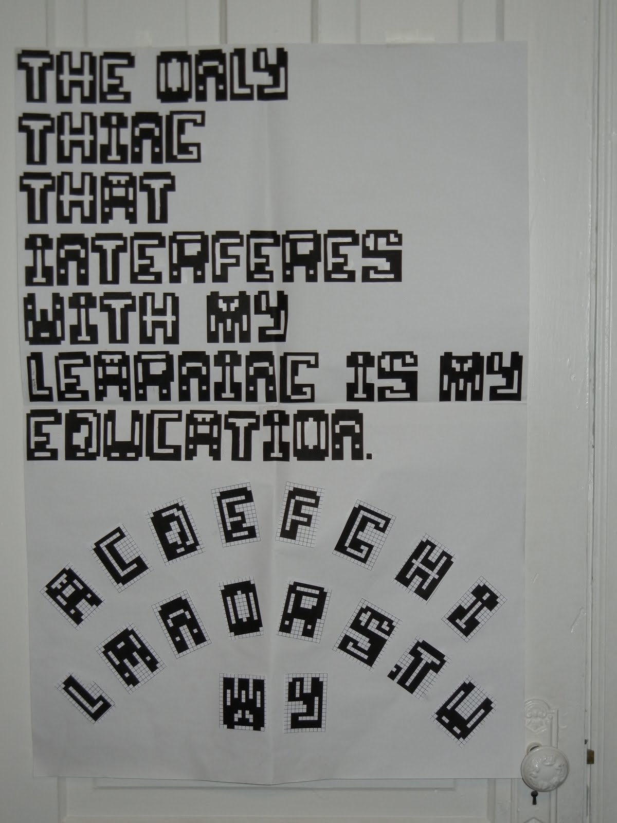
The assignment I'm most proud of is my first assignment for my Typography class. The assignment was to create a bitmap font (only using squares with no stair casing to make any curved lines) and I created these crazy letters. This assignment was my favourite but it was also the one that I put the most time into and did the most revisions for. I can point out flaws in it as well such as some letters appearing heavier than others, but when I look at it I don't really mind.
We had to pick a quote to write with our letters and this one is from Albert Einstein. Not something I would say I relate to in every way, but I can understand the sentiment behind it, and also kind of a funny thing for him to say.
This project holds a funny place in my heart because I did the entire project painstakingly on the Paint program (embarrassingly) and it really was hell. Then I xacto-knifed it every letter out (including the holes inside each letter) and then glued them all on this big paper. I was so happy to be done the project that I guess in my exhilaration I arranged the alphabet below in a weird way, but it's how I was feeling at the time.

-Lauren

REVIEW of the blog


The blog played many roles in this class. It was an icebreaker at the beginning after it became a place of sharing, and then it became process work. But best of all it is an entertaining way to get easy marks :-).

It is amazing how when we come to class we don't have to jump straight into work but we have a half an hour to relax and wake up while getting to know each other and familiarizing ourselves with different artwork.

My favorite blog posts were the very first ones and the very last ones because they are the most personal of all.

I never wrote a blog post before this class but it turned out to be fun. It's almost like a diary that I never had. :-)

I think this blog was an AWESOME idea!

Me As A Cartoon Character

This semester was amazing and full of exciting projects. Each of them taught me something about me and of course about art and design. I'm not the best artist or designer that got accepted to OCAD but if I was I would have nothing to learn here and I would be bored out of my mind.
I can not pick a project that is my favorite so I would just post the most resent and so it happens it is the same one that Trisha posted :-) but hey you get to see my personal view of that project. (P.S. Trisha, your portrait is amazing)


WOW! It looks better here then it does in real life (I love when camera doesn't work against you). I love this project because we got to full around with photo booth for homework.


Also, it's pretty cool because we were allowed to use any medium we want and didn't have many other guidelines. I like analog projects because they are a good combination to all the computer related work we do in other classes. It's is nice to switch between digital and analog because it is a completely different experience.

T-Shirt Design...?

This was actually my first painting work for my Colour in Context class. What we had to do was come up with one design for a T-shirt and use different colour scheme. If I remember, there was four colour scheme we had to do and then choose which one we like the most. The four colour scheme was monochromatic, achromatic, our favorite colours, and lastly our least favorite colours. The one you see below are my favorite colours. This actually ended up being my better paintings than majority of my others ones and I like this one the most. Though that doesn't really say much as I find it just about decent and the fact that I'm really really bad at painting. As you can see, this was basically a design of the sky that match the colours of the sunset going down. While I do like this one, I don't think it really goes well as a T-shirt design as they're more simplistic and usually have only one or two colours.

 (Sadly, this was best way I could've shown the whole image as scanning it would only show about 2/3 of the painting.)

As for the blog, I had quite fun with. Seeing other people's post was very enjoyable and interesting to look at. It's not often where you see students sharing their own personal opinion about a certain piece or a theme and I thought it was a great thing. Sadly, there weren't many frequent blog post mostly due to time constraints for many of us. Even so, I enjoyed it nevertheless.
This sketch I did for the book cover is my favorite piece of work this term. The reason why this is my favorite piece is because it was the only one where I actually did some illustration on a project this year. I love to draw and this project was the only one where I had to freedom to illustrate what I wanted.   

about the blog

I'm not really sure exactly what to say about the blog. I am new to blogging and was horrible at keeping up with it for starters but I think it was an interesting class element. Seeing what everybody posted was pretty cool. From pictures, to music, to video clips (ponponpon is a definite stand out LOL) I was exposed to material that I most likely would not have come in contact with otherwise and I can definitely appreciate the wide range in taste that was displayed across this class. All in all, good times, and if I were to do this again I would probably try harder to keep up with it.
-Tim-

sometimes I doubt your commitment to sparkle motion


One of my favourite pieces from this semester (aside from my work made for this class) would have to be my donnie darko painting for my colour and context class. We were to take an image (movie stills were a suggestion) and paint it using a range of shades from a colour scheme of our choice. I chose to use the complimentary colour scheme of orange and blue and a scene from the last half of Donnie Darko.

After having trouble with coming up with an idea, changing my colour scheme at the last minute and going through illustration board drama...I am actually really happy with the way this painting turned out.

Sadly, all I have at the moment is this crappy phone picture of it since as far as I know it's still on display in the school somewhere.

____________________________________________________________________

and as far as the blog goes I thought it was a great thing to have for this class. Seeing how everyone approached the same theme in many different ways was extremely helpful and interesting. I also had the chance to see some great work (and be introduced to some great music haha) I wish we had all posted in here more frequently however personally I found I often didn't have the time to post here besides for the weekly post (admittedly, often at the last minute)
..thankfully I've been getting my time management together.
overall its been great, thank you all :)

-Alex B