Wednesday, October 12, 2011

Creating form with form

I'll be honest, I didnn't know too much about collage nor did I had too much interest with this type of art form. So I decided to do some research and I have learned that there are different types of collage such as paint collage-collage done with paint, photomontage-collage made from photographs, digital collage-collage done with computer tools, decoupage-a type of collage when you decorate an object with paper cutouts, etc. No matter what type of collage though, the method will be the same; use variety of form to create a form. That's what I find collage quite interesting. The ability to create a form with something else that may or may not relate to the actual subject/form itself. My personal favorite is digitial collage as I was always into more of digitial art. For me digitial art has a very modern and stylish feel that aren't usually found in other mediums.


All work above was done by an artist called mashanayuki. You can see more of mashanayuki's work in the link below.

Skulls n Astronauts

The artist Alejandro Chavetta uses a blank background, usually devoid of colour, or with a slight unsaturated tone. He emphasizes the importance of his ideas using this method, as well as the contrasting tones in his collage. All his pieces give a dynamic introduction to the viewer. Interest is sparked from the instant the eyes meet the page. This technique I think is especially convincing because of his utilization of collage. The sharp edges in his buildings, and mechanical devices also contrasts with the natural and organic forms in the skulls and foliage.
Furthermore, these pieces make the viewer wonder what the object of them is. To inform of certain events, or perhaps political and social views of the world. Questions are asked and this is what gives the pieces their life. The viewer sees a futuristic interpretation of mankind, caught in in time. They decay and become skulls in the suits of the men they used to be...
I hope these three works have an impact on you guys as well.
You can see more of his work here: http://www.behance.net/AlejandroChavetta

"Squared Cities"

MONTREAL
TORONTO
BARCELONA


Photographer Daniel Hanai put his skills to the test when he deconstructed the most famous cities in the world and reunited them into a collage. He named these pieces "Squared Cities" and constructed them by assembling different views and angles taken with various camera settings. Personally, I would love to do something like this. I have some experience in photography so whenever i get the opportunity I will most definitely jump on it. When people think of "collage" they automatically assume "cut and paste" or assembling a number of images ontop of eachother. Rarely anyone thinks of photography.I thought these were beautiful...
hope you guys enjoy them aswell!

※ Moving Dynamic Effecting Collage ※

 COLLAGE:
The dictionary definition for "collage" is: "a piece of  art made by sticking various different materials such as photographs and pieces of paper or fabric onto a backing." This is according to the offline dictionary on my mac, so if you see something wrong with this definition take it up with Apple. Anyways, I immediately began to think of famous collages that have impacted me or I found particulaurly enjoyable, then realized that there weren't any. So I googled searched it. I found nothing really interesting. I was about to give up and randomly select an image + bullshit a reason for it, when I decided that collages do not have to be 2 dimensional. I use this oppurtunity to share two very awesome music videos from respectable artists. 


FIRST VIDEO:
In the beginning Regina throws cutouts into the scene that transform into the objects they represent; she begins to craft her world from bits and pieces. This is symbolic of the theme of the song which is building a city together with her romantic interest. To give more depth or specify the fantasy the collage in the video is composed of the main star (Regina) and cut outs from old newspapers and historical pictures to evoke a sort of industrial revolution or 18-19th century feel. It could be argued that it is not a collage as that definition my mac provided does not include video. However, you need only to pause the music video for it to transform into the definition. In fact, there are hundreds of great collages in this video, you need only to pause it at the right time. My favourite "still" would be at 2:03, where she is posed with the wine bottle and surrounded vintage cutouts and two pig men, while a Marilyn Monroe like actress stands behind, posed in a glamorous way. It really evokes the feeling of 1920s -1940s class. 

SECOND VIDEO:
This too is collagy and seems to have a vintage feel as well, almost the same period. However, it is a much much different vibe. Both videos have inspired me in the collage assignment and gave me some ideas, perhaps you will find inspiration or ideas here too. Hope you enjoyed them!


after talking about collage in class, I found myself seeing collage elements in places that I had never noticed before. these are some album covers that use collage. each of these covers use great techniques that make the cover art appear more textured by giving it that layered look. Personally, I find that this technique makes an album cover much more interesting and attention grabbing.

-Alex B
Collages are a lot of fun to make. Collages are put together and well thought out. The expression and message it conveys is the main focus. I chose this example because there is only one picture but all together it makes a beautiful composition. There are so many different kinds of fonts used in each cut out and every single one of them are emphasized or representative. I found this on deviant art, the artist said that it began as a collage about herself and then it became a 'let's find the coolest fonts in my magazine' collage. I think that her combined concepts was done really well.


Tuesday, October 11, 2011

Search

Collage? I admit at first I didn't know what to write. I went on youtube and typed in collage and stumbled upon collage humor videos (yay half an hour wasted there). So then I typed in art collage and went though a whole bunch of uninspiring videos until I found this video.


And it lead me to this amazing cite where I found this awesome collage.

I love it because it says so much with so little. The balance and the movement in this collage are amazing and it is not overcrowded like some of the collages I've seen in my search for "the one". The texture of the background looks very touchable and the dry leaves in the paper mache fill in the space without distracting the audience from the main action. It is, also, nice that there is some plain white but textured space around the collage. The thin black lines of the music exiting the persons mouth and ear are going into that white space which almost makes them look 3D. The upside down head is the most interesting thing in this collage because of it's unusual positon and separation of it form the body. The lines of color, add excitement and combined with the line created between the head and the gramophone lead the viewers eye in a circle in the middle of the collage. I like the other collages by the same artist but this one just spoke to me. The only thing I don't like is the little red stamp in the left bottom corner but hey even "the one" is not always perfect.

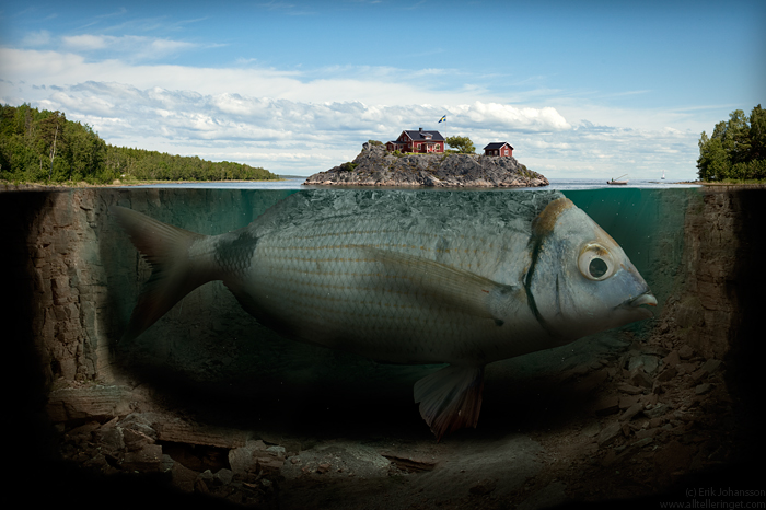
photomanipulation

Putting images together digitally.
Is that considered a type of collage?


artist: Erik Johansson
Like I'm really a big fan of this artist's works. And his personal works are these photomanip demonstrating both his skill and creativity. Looking at this collection makes me try to view real life through a surreal perspective.

Thursday, September 29, 2011

More ink projects!

Hello! So, this will be my first post, I really hope it gets posted with no fails. This is a video of ink going through bubbles..I find it really fascinating and interesting. I tried to find more about how it works, but then the words "compressed ink" & "food colouring" kept coming up, I tried googling that, but then I didn't get anything useful. So I am guess the artist put a bowel of water & bubbles and dripped in the ink? .. It kind of reminded me of the ink video that we saw in the class earlier with the bird and the skull. It is really hard to control these kind of ink projects and it takes a long time and a lot of practice to actually successfully apply ink in water and make a nice piece instead of just a mess, that's why I love those kind of pieces. They are complicated to make and they sometimes end up different from what we expected. This piece was done by: Kim Pimmel.

For some reason the video wont post ..
here is the link tho! Oh, and you will probably assume this is a last mine post kind of thing, but I usually use the computer at this time.

anyways, here is the link: http://vimeo.com/28304264 , Hope it works! enjoy~

Optical Mixing


Earlier in the week in my colour in context class I gave a presentation on colour interaction, and though the Colour textbook states some amazing information on how our eyes perceive colour (p55-65) I thought I'd zone in on one very interesting aspect of colour interaction known as "Optical Mixing". The painting technique known as Pointillism, which was developped by the French artist Georges Seurat, is a perfect example of the phenomenon. Optical mixing occurs when two different colours are placed beside each other, and on a grand scale such as a huge pointillism piece, the effect is all the more greater. What occurs is that when our eyes sees two colours applied in separate dots all around each other, though the colours aren't mixed physically, our eye mixes them up for us. So, for example if we see a pointillism picture of a tree with bark that is painted with red and green dots, then our eye will 'mix' the red and green and we will see brown basically. The interesting part about all this is that the effect of optical mixing produces colours that are more vibrant - so the brown that we see from our eyes optically mixing the red and green dots will appear more vibrant and interesting than if the brown was physically created on a pallette by mixing red and green paint. It's fun to look at pointillism pieces and see this in action so above is George Seurat's "Bridge at Courbevoie" 1886-7. His pieces often took a couple of years to make, and the point of the art form is to let none of the dots bleed into the image, but for them all to be seprarate and your eyes do the rest :)


-Lauren


Colour as a tool of provocation.


“Look Me in the Eyes and Tell Me Honestly:
Who is your friend? Who is your enemy?
You have no friends among capitalists.
You have no enemies among the workers.
Only in a union of the workers of all nations will you be victorious over capitalism and liberated from exploitation.
Down with national antagonisms!
Workers of the world unite!”


In many classes at this school, I have found myself, as i'm sure many if not every other student in first year have also found themselves, questioning the nature of the human reaction to colour. As designers, colour and the corresponding collective reaction to it is paramount in our creation, seeing as our creations are more purpose bound than self expression pieces.

I find a great example of this form of colour utilization is to be found in propaganda, namely that of the Soviet Union. Marxism at it's core rejects vanity and religion, among other things, and therefore in states like China and Soviet-era Russia, the government takes it upon themselves to capitalize on the absence of those elements from people's lives by readily and visibly placing figures and symbols of the state and government in the people's mindset. The most popular method that Soviet propaganda departments would use to incite the feeling of the state's hand, would be to employ overpowering amounts of red, in high contrast and in the focal point of their images. Red is a colour with many emotional interpretations, however during the cold war red was the undeniable symbol of Soviet and communist ideals, and thus propaganda would employ it to incite the feeling of the Soviet Union's power, making the viewer uneasy, or even in fear of the subject matter, Russian or no.

A masterful use of colour can be found in the top poster, a poster literally and figuratively inciting the viewer to look into the eyes of Lenin. The employment of yellow in the composition essentially leaves the viewer uneasy and unwilling to do as the words command, words that demand that you reflect on any wrongdoings to the state and reminding you you should feel very bad about betraying your friends if you did (as if ten years in a hard labour camp wouldn't do that well enough). You look into the eyes of this yellow giant, and you are very aware of his power, you know he's looking for something and you can tell that there are bad things coming if he does indeed find it, and the colour and tone have illustrated that horrifyingly well.

※ Color and Music and Soul ※

I am an emotional individual, not a logical thinker. Often I "think" in emotions and when I do not know what that emotion is I give it a color (I feel more than I think, give these "thoughts" colors). So to me, (and I assume to everyone else) colors are almost synonymous with emotions. Music videos (good ones) use this to their advantage as they communicate their message through color. They set a mood or atmosphere and evoke a certain emotion through association (e.g a grey color scheme may evoke empty or cold feeling, like a cloudy day, depending on how the director uses it). I would like to share this video with you as it an excellent example of how color can engage. Click Here:  Sigur Rós - Viðrar vel til loftárása

Sigur Ros is amazing band as not only do they create haunting and moving music, they also help and sometimes direct their own music videos so that the song and the video "harmonize". I do not want to analyze or talk about my own interpretation of the video too much, as I do not want to taint your subjective impression. However, I will say that the video bought me emotionally with its cloudy and gloomy-optimistic colors and then turned my insides out towards the end using unsettling visuals that are emotionally challenging. It bought my trust and then squeezed my arm a bit too hard, and at that moment I was confused as to how to feel. It challenges expectations and manipulates your skin when you are inside it's atmosphere, taking you on an emotional roller coaster. 

Another thing that I would like to share is this video by Bjork. A woman that I find both beautiful and infinitely interesting. Her weirdness and the amount that she invests "herself" into her work make her a rewarding artist to follow as when you "get" Bjork, you get a great feeling of accomplishment. However, that is not why I am posting this video. The reason I post it is because it is one of her most colorful videos, and yet there is no color. Anything visual that is used to represent this song while it plays, so long as it is on a gray scale, would be tainted with color when this song plays in the background. Listen to it and allow your mind to enjoy this colorful feast as your eyes see black and white while the eyes inside your head register and project a range of color combinations unique to you. I can't guarantee that specific color images will approach you, but it did it happen to me. Click Here: Bjork - Big Time Sensuality

On another note: sorry these links are not presented on this blog as big, flashy YouTube thumbnails. I feel the YouTube uploads of these are bad quality and distract from the beauty of these videos and songs. I would also like to say thank you to anyone who actually invests their time to read all this and see both videos, I realize that it is a lot of stuff to look through. Thank you, and I hope you enjoy these videos as much as I did!

Jonsi (left) the lead singer of Sigur Ros and Bjork (right) are among my favorite artists, give'em a listen. ;)

Color comes in a wide assortment of ranges and shapes and they play an important role in our daily lives. The colors we see help don’t just help us to differentiate objects and signals but they also help us identify and simplify the way we perceive our world. However not all colors appear to be what they are in plain sight. When particular shapes and variations of color are put together we sometimes get optical illusions. The video I posted is a good exercise on color and apart from having great music, it does a good job of informing us of certain image and color anomalies.   

Dawa Bokhang

Green and Red - Complementary?

http://www.null-hypothesis.co.uk/science/strange-but-true/profs-probings/colour_spectrum_magenta_complimentary_bizarre Now, as I'm sure most of you know red and green are supposed to be complementary colours, yet there is a problem. The light spectrum is out of balance, and there is no complementary colour for green, I believe. So our minds made up the colour magenta - or pink, as shown above - to complement it - and the complementary colour to red is actually turquoise! Read the article fully for a better comprehension and statement of accurate facts. I found this absolutely amazing, if it is true... If you stare at this dot of magenta for around 30 secs, then look at a blank white wall, you should see its complementary colour.

Another Way Of Self-Espression


Color is a very beautiful and effective way of self-expression. While I am not brave enough to experiment with my eye makeup like that, I admire and get inspired by people who get creative with it.
The eye makeup artist's job is just as challenging as that of a painter. Not only do they have to color co-ordinate the eyeshadows with each other, they also have to make it match the person they are doing the make up for. It might be hard work but look at the results! Such vibrant colors that fit together and create a dramatic effect.

Image is from <3SwEeTie<3's profile on Fliker.